Latest Responsive CMS website launched for an Infertility Clinic in Delhi: Seeds of Innocence
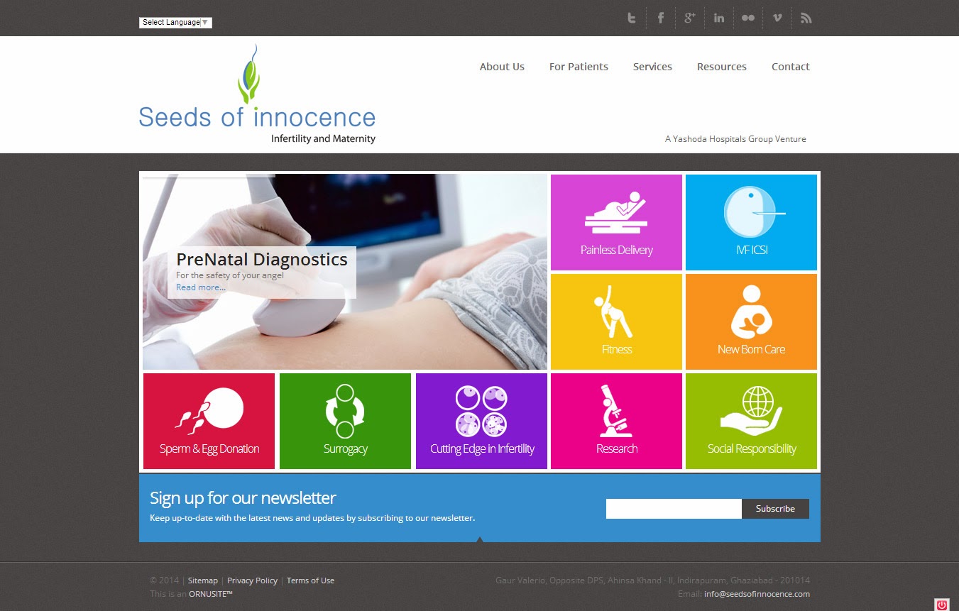


1. Home Page
Regardless of our connection speed, Internet users expect information to be readily obtainable, pages to download quickly and solutions at the click of the mouse.
As such, you should look at your home page as your Sale point. Have you explained succinctly what you are selling and included links to more detailed information?
Note that on the first page, you should try to pre-sell your potential customers on the benefits of your product or service.
If you are offering many products or services, place only the most attractive website design on the first page. Do not overload your first page. People might get confused if you provide too much information on one page.
That is one of the reasons why good website design company will always advise customers not to use flash intros on their first page or at the very least, allow them to skip through it. Today, internet users have less patience to wait and will move on quickly if pages take too long too load or if they have to "wait through" fancy openers that are all flash and no substance.
2. Site structure
Structure of your site should be dedicated to one goal only. Leading the visitor from your home page (pre-sale point) to different pages (sale points) on your site.
Structure of your site should be as simple as 1 - 2 - 3.
The 1 should be your home page, where you provide the basic information (read benefits) about your product or service.
The 2 should be a "more details" page where you will list and elaborate on benefits and prices of your product
And 3 should be your "add to cart" or "contact us" page.
3. Navigation structure
If you are serious about having your business on the Internet, do not experiment with the navigation of the site. Keep it simple and easy to use with attractive website design. If your pages are long, place a menu on the bottom of the page to save your users from scrolling to the top of the page to reach the menu.
4. Text
Do you believe that people read everything written on your page? They don't. What they do is SCAN. They are scanning your page, looking for specific information regarding your company, what you have to offer, pricing and how to contact you. What you say and how you say it can mean the difference between a visitor and a sale.
For first timers, the look and content of our pages may evolve based on customer needs and comments. So...always, be sure to include search options in case visitors don't find what they are looking for as well as readily obtainable contact information. Most importantly, make sure someone is available to answer questions. Never keep a potential first-time customer waiting for information.
In many cases, search option will keep the visitor on your site, giving you one more chance to convert the visitor into a customer.
5. Creating emphasis
Having in mind that users scan the pages, determining what to emphasize and creating emphasis on your pages is very important.
Eye catching details with attractive web design will help you to lead the visitor to the pages on your site that you want to be exposed, and it will increase your chances to convert the visitor into a customer.
6. Graphics
Graphics should emphasize the benefits of your products or service. Don't use graphics unrelated to your product or service. Placing the graphic on the site just because you like the graphic, and you think that your site looks better with it is simply wrong. Use that space to explain to your visitors why they should buy from you and not from someone else.
Graphics should emphasize quality of your product or service. If you can't find or create such a graphic, use text. It's that simple.
7. Speed
Faster is better. There are still millions of people still using dial up for their connection. So try to make the download time for your site as short as possible. Remember, time is money and the longer it takes to download your website, the faster potential customers will go elsewhere for their business.